kesem brand refresh
From 2020 to 2022, Kesem embarked on an effort to rebuild our brand. The aim of this Kesem brand refresh was not to revolutionize who we are but to evolve us in ways that better position the brand in the minds of others to do even greater things for the kids and families we serve.
The output of this important work was the construction of a brand strategic framework, the shaping of a brand story, and the introduction of new visual identity touchpoints.
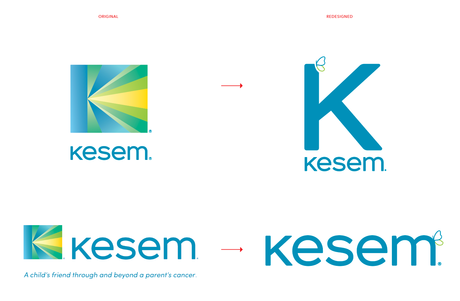
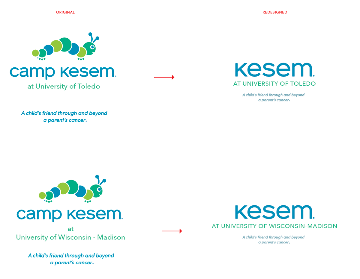
When developing the new Kesem logo, the primary goal was to evolve the mark for the Kesem brand and create something that can stand on its own, something that looks like us and is familiar to those who already know and love Kesem, and something that meaningfully connects to the programmatic core of our organization—Camp Kesem (and it's caterpillar mark). Overall, it feels serene, optimistic, and just slightly playful.
This illustration is simple. It’s just two lines, in two colors, perched on the edge of our Kesem logotype. But whether folks know Kesem in the depths of their hearts, or are just hearing about what we do for the first time, this butterfly mark means that Kesem transforms lives. To know our organization means to know a powerful, transformational journey. Lightness in dark. Wings where there were once none. And we want everyone who looks at our brand mark to remember that.
For a more comprehensive look at the brand, take a look at the brand book that was built as a part of the project.